
Kevin Mulligan, director of the centre, said the map was developed following a lack of new information presented on major news outlets.
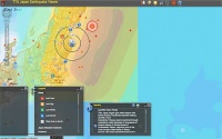
The map connects to near-real-time remote feeds from the US Geological Survey’s (USGS’s) Earthquake Hazards Center and the National Oceanic and Atmospheric Administration’s Tsunami Warning Center.
’This map is a dynamic map surface that shows the distribution of recent earthquakes from a USGS live remote feed,’ Mulligan said.
’It provides map information, satellite imagery and location of recent earthquakes. As part of this major earthquake, there are hundreds of aftershocks that follow,’ he added.
The Texas Tech University map can be viewed at: http://mapserver.gis.ttu.edu/japanquake


Infinitely reusable mould promises 14x additive speeds
It is difficult to tell what their process is . I looked up polymorphic moulding and, on a site <a...